If you were to throw a dart at a map of the Earth, the statistical probability of it hitting a human settlement is virtually zero. Despite a global population approaching 8.2 billion, the overwhelming majority of our planet remains uninhabited.
The visualization above is not merely a map of where we are. It is a map of geographic resistance. The vast dark spaces—the Canadian Shield, the Australian Outback, the Amazon Basin, the Himalayas and the Saharan belt—represent terrain that has successfully repelled large-scale urbanization for millennia.
Overcrowded Cities, Empty Planet
Our intuition is biased by cities. Most of us live in dense urban or peri-urban environments, where noise, traffic and rising rents create the feeling of a species on the brink of spatial collapse. This map corrects that intuition.
- Half of humanity lives on a tiny fraction of Earth's land surface.
- Vast interior regions of continents contain almost no permanent settlements.
- Infrastructure, climate and altitude matter more than political borders in shaping where we actually live.
In The World Pulse, this dataset anchors the demographic track: it is the baseline against which you compare light, cables, cellular networks, and economic output.
The "Valeriepieris" Circle
The density of human life is so uneven that there is a circle centered over Southeast Asia, roughly 4,000km in radius, that contains more living humans than the entire rest of the world combined.
- Pearl River Delta (China)
- Ganges Plain (India)
- Java (Indonesia)
- Greater Tokyo (Japan)
In the World Pulse missions, mentally “drawing” this circle helps you quickly locate the densest clusters on any unconstrained map.
The Identity Challenge
In the World Pulse Game, identifying this map is deceptively difficult because it correlates heavily with other modern indicators.
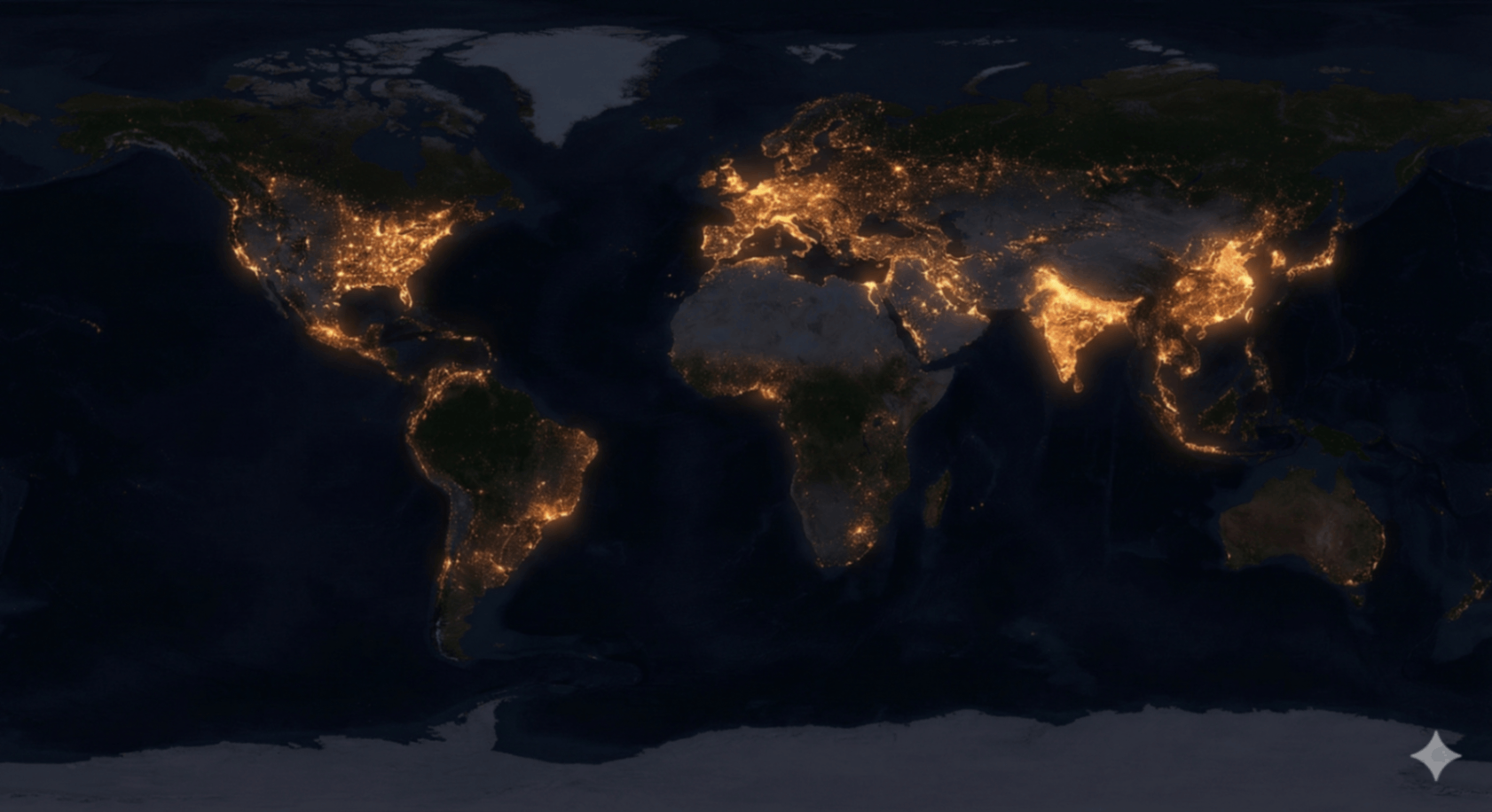
Users frequently mistake this for a map of Cellular Coverage or Light Pollution. While similar, they are not identical.
The key differences to look for:
- Sub-Saharan Africa: On a light map, much of the continent is dark. On this density map, it glows with millions of people living in low-infrastructure environments.
- High-income rural areas: Parts of Scandinavia, Canada or Australia may emit light without corresponding dense population—these stand out on luminosity maps, not on density maps.
- River corridors: The Nile, Ganges and Mekong carve razor-thin bright lines here that may be less obvious in telecom or cable datasets.
"This map proves that presence does not equal power. Some of the brightest spots on this map are the poorest regions on Earth."
The World Pulse syllabus uses this tension—between where humans are and where infrastructure is—as a mental gym. Your job is to learn which patterns belong to people, and which belong to systems built on top of them.
Reading the Great Empty
Demographers and planners use maps like this to answer questions that raw population totals cannot touch:
- Infrastructure planning: Where does it make sense to build new transport corridors and where would roads simply cross empty land?
- Climate risk: Which densely populated coastal strips are most exposed to sea-level rise or extreme heat?
- Food and water stress: Where are people pressed up against the limits of arable land and freshwater access?
Inside the Arcade, these questions become logic challenges: you are asked to infer migration pressure, infrastructure load, or vulnerability just from the shape of the density pattern.
Test Your Perception
Can you distinguish between areas of high population and areas of high economic output? The difference is subtle, but crucial for anyone reading global data.
The Great Empty dataset appears in multiple missions. Each time, it is paired with a different map—lights, cables, shipping or cellular—so that you gradually build an instinct for what “raw humanity” looks like from orbit.
Continue the Briefing
Use this article as your demographic briefing, then connect it with other World Pulse layers that sit on top of the same planet.
Major Urban Areas
Zoom into the brightest nodes on this map and study how mega-cities reshape their regions.
Cellular Coverage
Compare where people live to where they are connected. Spot the coverage gaps.
Arid Zones
Study the hostile environments that form the backbone of the Great Empty.