Why Map Literacy Matters
In a data-driven world, understanding geospatial visualization is a critical skill. It allows us to see the invisible connections between economy, geography, and ecology.
Read Briefing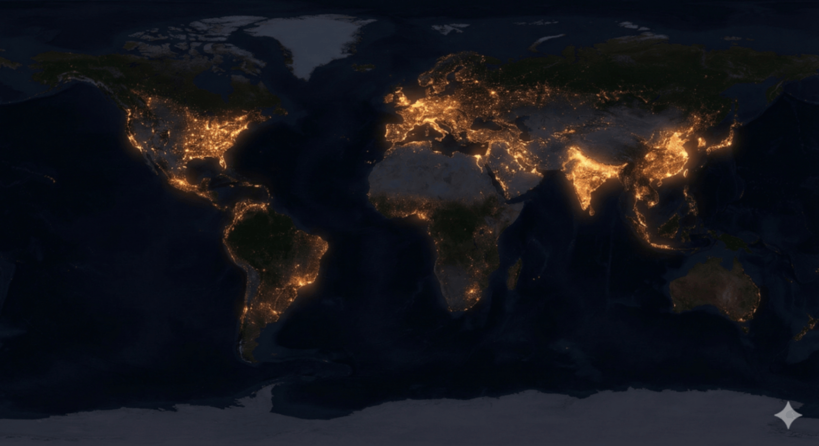
A visual challenge. We show you the data; you identify the human activity. From shipping routes to glacial shifts.
A geography test for the modern age. We've stripped away the borders and labels. Can you recognize the world purely by its data footprint?
In a data-driven world, understanding geospatial visualization is a critical skill. It allows us to see the invisible connections between economy, geography, and ecology.
Read BriefingThese visualizations utilize open-source satellite telemetry and census data. By removing political borders, we reveal the true organic structure of civilization.
Source DataTest your memory, logic, and speed with 12+ other cognitive modules.
Go to Arcade
We all have a mental map of the world, but how accurate is yours? The World Pulse is a data-driven game designed to expose the gaps in your geographical intuition. It relies on the "Mercator Distortion"—the fact that standard flat maps warp the size of countries near the poles, making Greenland look as big as Africa (spoiler: it's not even close).
The game presents you with binary choices based on live global statistics. Speed is key, but instinct is your enemy.
In an interconnected world, geographic literacy is a superpower. Understanding the true scale of nations, populations, and economies helps you decode the news and understand global dynamics. This game gamifies the CIA World Factbook, turning dry statistics into a high-stakes test of your mental model of Earth. Adjust your coordinates and jump in.