Decoder Index
Fast navigation • intent matching • better UX
What You’re Seeing on a Global Air Traffic Map
An air traffic map is the closest thing we have to a live diagram of modern globalization. If shipping routes show where goods are stored, air traffic shows where time is being compressed.
Most people recognize a live flight tracker as “planes moving.” But the deeper pattern is the infrastructure underneath: airport density, economic hubs, airspace corridors, and rules that keep aircraft inside safe diversion envelopes.
Compared to shipping routes, aviation carries a different mission profile: shipping optimizes for volume and cost; aviation optimizes for speed and value. Compared to internet cables, aviation is physical and constrained by weather, terrain, and regulation.
Quick Decode (for the impatient)
Thick bands over North America + Europe
That’s not “more sky.” It’s higher population + airport density + business travel networks + hub clustering.
Clean endings at nodes
Flight paths terminate at airports. Satellite orbits don’t “end.” Cables don’t “land” at random.
Dark zones in high terrain
High terrain reduces safe descent margin and diversion logic. “Not flying there” is often physics + safety.
Eastbound vs westbound asymmetry
Jet streams turn the Atlantic into a conveyor belt in one direction and a headwind wall in the other.
The Great Circle “Curve” (Why Flight Paths Look Wrong)
One of the most searched questions is: “Why do flight paths curve?” The answer is simple: on a sphere, the shortest path is a great circle route (a geodesic). On a flat map, that straightest path appears curved.
This is why New York ↔ London corridors may arc toward Greenland. It’s typically not a detour. It’s geometry plus winds. In a good flight path map, the curvature is a signature.
Comparative lens: ships often prefer stable latitudes and chokepoints; planes can “cut across” empty ocean and polar arcs as long as diversion rules are respected.
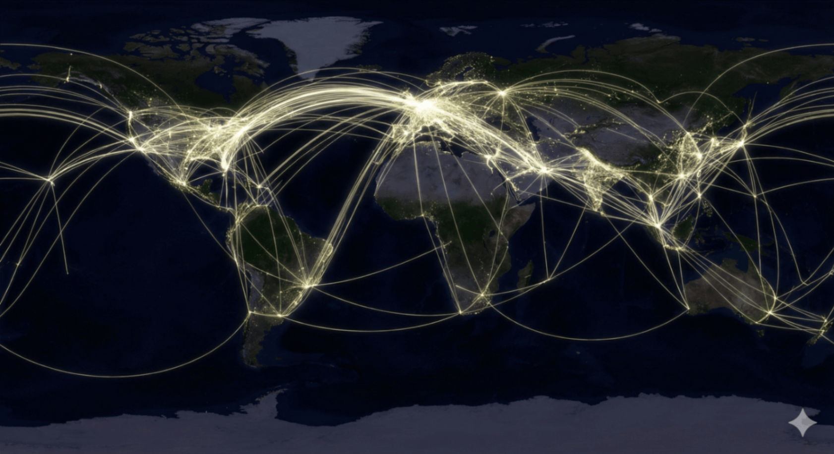
Hubs vs Point-to-Point: The Network Shape of Aviation
On a global air traffic visualization, airports are not equal. You’ll see intense “spokes” around major hubs. This reflects the hub-and-spoke model: concentrate flights through hubs to increase connectivity and aircraft utilization.
Compared to a point-to-point system (more direct routes, less hub dependence), hub networks generate higher corridor density and clearer “spiderweb” signatures on the map.
- Hub signature: thick radial spokes + heavy clustering around a few nodes.
- Point-to-point signature: broader spread of routes with fewer dominant centers.
- Economic signature: business corridors thicken where time-value is highest.
Constraints & Voids: Why Some Regions Stay Dark
People assume “no flights” means politics. Sometimes it does. But the most reliable explanation is usually: terrain + weather + airport spacing + diversion logic + demand. In other words, aviation maps are as much about what’s difficult as what’s popular.
High-altitude regions
High terrain reduces safe descent options during emergencies and complicates alternate airport planning.
Airport spacing
Fewer diversion airports means stricter routing envelopes. Oceanic and remote corridors must be planned.
Economics & flow
Airlines fly where demand exists. The map is a graph of purchasing power and time preference.
ETOPS & Oceanic Tracks: Invisible Rules Over the Atlantic
A common SEO query is “What is ETOPS?” In practical terms, ETOPS is a certification and planning framework that allows twin-engine aircraft to fly long distances away from diversion airports. The result: you get structured arcs and corridors over oceans rather than chaotic scatter.
Over the North Atlantic, traffic often organizes into time-based tracks (commonly called “oceanic tracks”). The corridors are shaped by wind, capacity, separation standards, and operational constraints.
Aviation maps are not only “where people go” — they are “where rules allow flow at scale.”
Jet Streams: Why One Direction Is Faster
When people search “Why are flights to Europe faster?” the answer is usually winds. Jet streams are fast rivers of air at cruising altitude that can boost ground speed in one direction and punish it in the other. On aggregated maps, this produces subtle corridor asymmetries.
Eastbound advantage
On many days, eastbound transatlantic traffic benefits from tailwinds, allowing more efficient routing and timing.
Westbound penalty
Westbound traffic may route differently to reduce headwind exposure, affecting corridor thickness and track choice.
Mobility Layers: Air Traffic vs Shipping vs Internet Cables
These three maps form a modern “movement stack.” If you can compare them quickly, you can identify each one in seconds inside the World Pulse game.
Shipping Routes Map
Slower, heavier, chokepoint-driven. Optimized for volume and cost, not speed.
Internet Cable Map
Fixed infrastructure. Dense landing points. Built for latency and bandwidth.
Night Lights Map
Economic demand proxy. Explains why certain corridors exist in the first place.
Flight Log: Practical Appendices
Operational NotesADS-B: How Flight Tracking Works
ADS-B (Automatic Dependent Surveillance–Broadcast) allows aircraft to transmit position, altitude, and velocity to receivers. Aggregated ADS-B feeds power many “live flight tracker” maps. Your visualization is a time-integrated signature of that broadcast layer.
Flight Corridors vs Contrails
A corridor is a repeated route preference shaped by hubs, wind, capacity, and safety rules. Contrails are a separate atmospheric effect. Contrail “maps” can resemble traffic, but they depend on humidity and temperature — aviation corridors don’t.
Diversions, Alternates, and Safety Envelopes
Route planning includes alternate airports and diversion feasibility. Over remote areas and oceans, planners ensure aircraft remain within defined operational envelopes for contingency scenarios.
Why This Map Gets Confused with Other Maps
Aviation can resemble submarine cables, shipping, orbits, or rail density. The key difference: aviation terminates at airports, forms hub spokes, and shows strong intercontinental bands.
Glossary (Fast Definitions)
The shortest path on a sphere; appears curved on flat maps.
A certification/planning framework enabling long overwater twin-engine routes within diversion constraints.
Aircraft broadcast system for position/altitude/velocity used in tracking visualizations.
Network strategy that concentrates routes through hubs, creating dense corridor “spokes.”
FAQ (Quick Answers)
Is this a live flight tracker? Not exactly — it’s a time-integrated air traffic signature built from tracking broadcasts and route patterns.
Why is the Southern Hemisphere “quieter”? Lower population density + fewer hubs + fewer intercontinental demand corridors.
How do I identify aviation instantly? Look for intercontinental bands, hub spokes, and clean termination at airports.
Test Pattern Recognition
Can you spot global air traffic when it appears unlabeled and decontextualized next to shipping, cables, night lights, and orbits? This is exactly what the World Pulse simulation trains.