Decoder Index
What the Black Marble measures and why economists care.
Signal, noise, composites, and what “radiance” really means.
How to identify night lights versus population density or shipping.
Korea, energy corridors, conflict dimming, and “resource lights.”
Gas flares, fleets, saturation, and policy-driven lighting changes.
Nowcasting, monitoring shocks, and cross-checking official narratives.
Rules-of-thumb for winning in the simulation (fast).
Search-friendly answers and definitions you can skim.
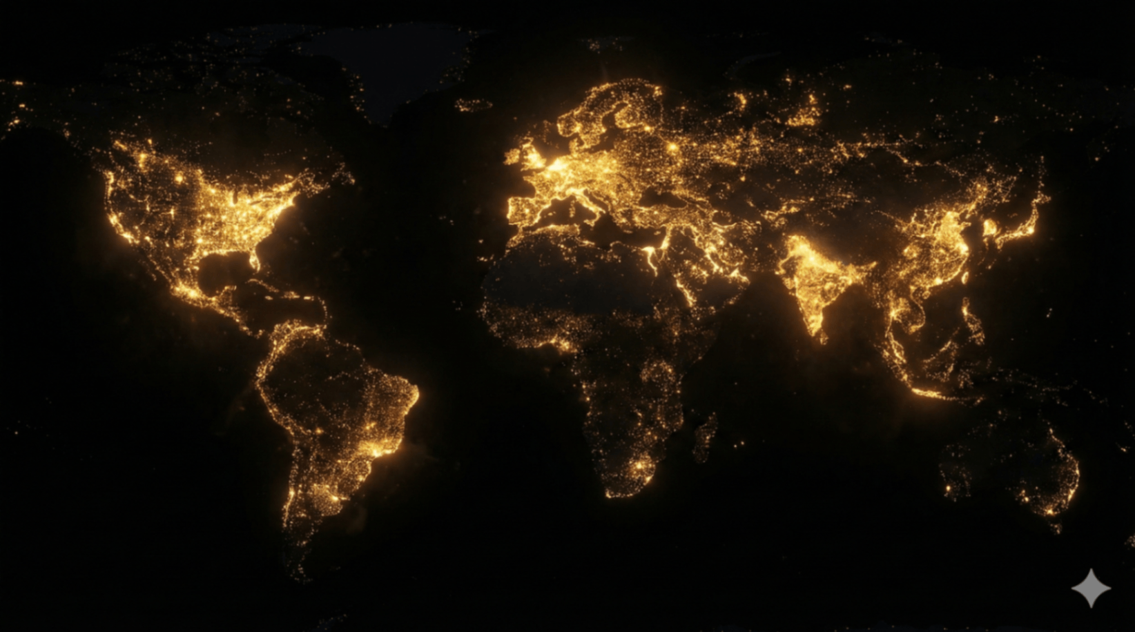
When the sun sets, the political map dissolves. The economic map reveals itself. The visualization above is often called the “Black Marble”: a global composite of nighttime radiance that captures persistent human light emissions.
Night lights are not “wealth” in a moral sense. They are a proxy for electrification, infrastructure density, and energy consumption behavior. Light requires electricity. Electricity requires generation, distribution, maintenance, and usually a stable institutional substrate. In aggregate, brightness becomes a shadow accounting system: it is harder to fake at scale than a press release.
From Pretty Image to Economic Instrument
Economists, development researchers, and risk analysts use night lights for a simple reason: official statistics are delayed, incomplete, and sometimes politically curated. Night lights can offer a faster, independent “second opinion” on what is happening in the real economy—especially in regions with limited measurement capacity.
- Cross-checking claims: If reported growth rises but persistent brightness stalls, analysts investigate the mismatch.
- Estimating informal activity: Electrification and settlement expansion can hint at growth not captured by formal tax systems.
- Monitoring shocks: Blackouts, disasters, and conflict often show up as sudden dimming before official reports catch up.
- Infrastructure inference: Bright corridors indicate dense grids and logistics; dark gaps indicate fragility or sparse distribution.
In The World Pulse track, your job is not to memorize economic facts. It is to build a reflex: when you see this glow pattern, you know what kind of system you are looking at.
Telemetry Analysis
Signal / Noise / Composite Logic“Night lights” is not a single photograph. It is a processed product. Satellites collect many observations over time; cloud cover, moonlight, seasonal atmosphere, and transient events must be filtered. The goal of the composite is to preserve persistent human-made lighting while suppressing temporary noise.
The core measurement is radiance—how bright a pixel is at night from orbit. Brightness is influenced by streetlights, building density, industrial facilities, ports, airports, and commercial corridors. It is not a direct measurement of income; it is a measurement of emitted light.
Interpreting rule: radiance is a physical signal; “wealth” is an inference layered on top.
Good composites try to down-weight or remove: cloud interference, lunar brightness, aurora, seasonal fires, and short-lived events. Even then, artifacts remain: snow and desert surfaces can change perceived intensity, and very bright city cores can saturate.
Analyst move: treat the map as a starting layer—then cross-check with other datasets.
Year-to-year brightness change can reveal growth corridors and electrification rollouts before census and economic revisions are published.
Urban cores saturate; peripheral “rings” often provide better comparative information about expansion and new development.
Bright ≠ rich automatically; dark ≠ poor automatically. The map measures light, then you infer structure from context.
The Map Signature: How Night Lights “Look”
In the World Pulse rotation, night lights are commonly confused with population density and sometimes with shipping. The confusion is useful: it forces you to separate “where humans exist” from “where electrified consumption concentrates.”
Four fast tells (use these under time pressure)
1) Coast + Corridor dominance
Night lights form luminous coastlines and inland corridors. Look for “strings of pearls” connecting cities along highways and rivers. Population maps fill interiors more evenly; light maps highlight infrastructure.
2) Dim megaregions exist
High population does not guarantee high brightness. You will see large human regions that remain relatively dim if electrification is limited or lighting is less intense.
3) Isolated bright “non-cities”
A single industrial facility, refinery, gas flare field, or port can produce a bright pixel cluster without a large resident population. That is a night-lights tell.
4) The ocean is mostly dark
Shipping maps light up the oceans with dense lanes; night lights keep oceans largely black, except for fleets, platforms, and a few coastal hotspots.
A population map shows where people are. A night-lights map shows where electrified consumption concentrates.
Case Studies: Reading the Glow Like an Analyst
These are recurring patterns analysts look for: corridors, discontinuities, and “control variables.”
The “Blue Banana” corridor
Notice the continuous arc of light from the UK through Benelux and along the Rhine into Northern Italy. On a night-lights composite, this corridor appears as a dense, nearly unbroken band—evidence of historic industrial clustering, logistics infrastructure, and high-value service density.
In-game tip: the corridor is “too continuous” to be population alone. The continuity comes from highways, commuter belts, ports, and industrial sites stitched together.
The Korean Peninsula contrast
One of the most-discussed signatures in night lights is the stark contrast on the Korean peninsula: a bright, dense lighting signature in the South and a far darker profile in the North, with a limited number of concentrated nodes. It is a dramatic example of how grid intensity and lighting distribution can diverge sharply inside a shared geography.
Analyst framing: it is not “culture vs culture.” It is an infrastructure footprint—generation, distribution, and usage patterns.
Flares, refineries, and extraction halos
Some of the brightest non-urban signals come from extraction and processing: refineries, petrochemical complexes, and gas flares. These clusters are typically isolated, often in deserts or coastal industrial zones, and do not form the “city web” of road-connected nodes.
World Pulse trick: if it’s bright but surrounded by deep darkness and lacks a branching network of smaller towns, suspect industrial or resource light.
Dimming as a diagnostic
Major blackouts, disasters, and conflict can manifest as abrupt dimming or fragmentation of previously continuous light networks. Analysts treat sudden changes as alerts—then validate with other sources: grid reports, on-the-ground updates, and independent satellite layers.
The key insight: lights can change faster than official narratives. That speed makes the dataset operationally valuable.
Mini-Checklist: What to ask when you see a bright cluster
Does it have suburbs, a road-like web, and nearby secondary towns?
Is it isolated, coastal/river-adjacent, or aligned with resource basins?
Could it be fleets, fires, or seasonal activity that composites partially remove?
What This Map Gets Wrong (and Why That Matters)
Night lights are powerful precisely because they are physical. But physical signals still have biases. Serious interpretation requires recognizing where the dataset overstates or understates human reality. The goal is not to “trust” or “distrust” the map—it is to understand its failure modes.
False positives (brightness without broad wealth)
- Gas flares: persistent combustion can outshine nearby towns.
- Ports & industrial complexes: intense lighting for operations and security.
- Fishing fleets: bright offshore points (especially squid fishing) that mimic “floating cities.”
- Mining sites: isolated brightness far from population centers.
False negatives (people without brightness)
- Informal settlements: high density, low lighting, weak grids.
- Energy-efficient policy: lighting regulations can reduce radiance without reducing income.
- Rural populations: large numbers can exist in dark interiors.
- Power rationing: periodic outages flatten the signal.
Saturation: when “brighter” stops meaning “more”
In very bright urban cores, sensors can saturate: the map shows a white-hot center that changes little even when the city grows. That is why analysts often track the edges—the expanding ring of medium brightness—where new development and grid expansion show up more cleanly.
Practical takeaway: for trend detection, watch the periphery; for structure recognition, watch the network shape.
How Analysts Use Night Lights (Operationally)
The most valuable feature of night lights is not philosophical. It is temporal. Many economic indicators arrive late. Night lights can be updated more frequently and can be compared across time with a consistent sensor framework. That makes the dataset useful for nowcasting (estimating the present) and impact assessment (measuring shocks).
Three high-value workflows
Nowcast growth corridors
Track brightening along roads and suburban belts to infer urban expansion, industrialization, and electrification rollouts. Cross-check with population and power-plant layers for causality.
Measure disruptions
Blackouts and disasters can appear as sharp dimming. The spatial footprint can hint at grid topology: what failed, what stayed, and where resilience exists.
Validate narratives
When official numbers are delayed or contested, lights provide an external reference point—imperfect, but independent. Analysts interpret it as evidence, not as a verdict.
This is why the map “feels” like truth: it is a physical trace. But the professional posture is disciplined: treat the map as one instrument in a larger dashboard of indicators.
Calibrate Your Vision
Can you distinguish the glow of a megacity from a refinery flare field, and a coastline from a fishing fleet—when the timer is running and labels are removed?
Win Conditions: 5-second recognition rules
- Look for “city webs”: branching suburban networks around hot cores.
- Check the oceans: mostly dark indicates night lights (not shipping).
- Scan for isolated industrial flares: bright, detached, non-urban patterns.
- Compare interiors: large dark inland regions can persist despite big populations.
- Find corridors: continuous bands between cities signal infrastructure, not just people.
Inside The World Pulse, this dataset appears alongside cables, shipping lanes, population grids, and power plants. The objective is reflex: identify the layer instantly.
FAQ + Glossary
Skimmable answersWhat does the night lights map actually measure?
Why is it called “Black Marble”?
Can night lights detect the informal economy?
Why do some oceans show bright dots?
- Radiance: observed brightness per area (sensor measurement).
- Composite: many observations combined after filtering noise.
- Electrification: access to and usage of electric power infrastructure.
- Saturation: when bright cores stop showing meaningful increases.
- Proxy: a substitute indicator that correlates with a hidden variable (like GDP).
- “Bright = rich everywhere” (ignores industrial and policy lighting).
- “Dark = empty” (ignores dense low-light populations).
- “No change = no growth” (core saturation hides increases).
- “All ocean lights are cities” (often fleets/platforms).
Continue the Briefing
Use this page as your orbital debrief, then jump into live simulations and drills that turn interpretation into reflex.
World Pulse: Night Shift
Identify the Black Marble layer among other global datasets—under time pressure.
Power Plants: Energy Spine
Compare night lights with generation sites and grid structure.
The Great Empty
Study where people live but lights vanish—the negative space of development.