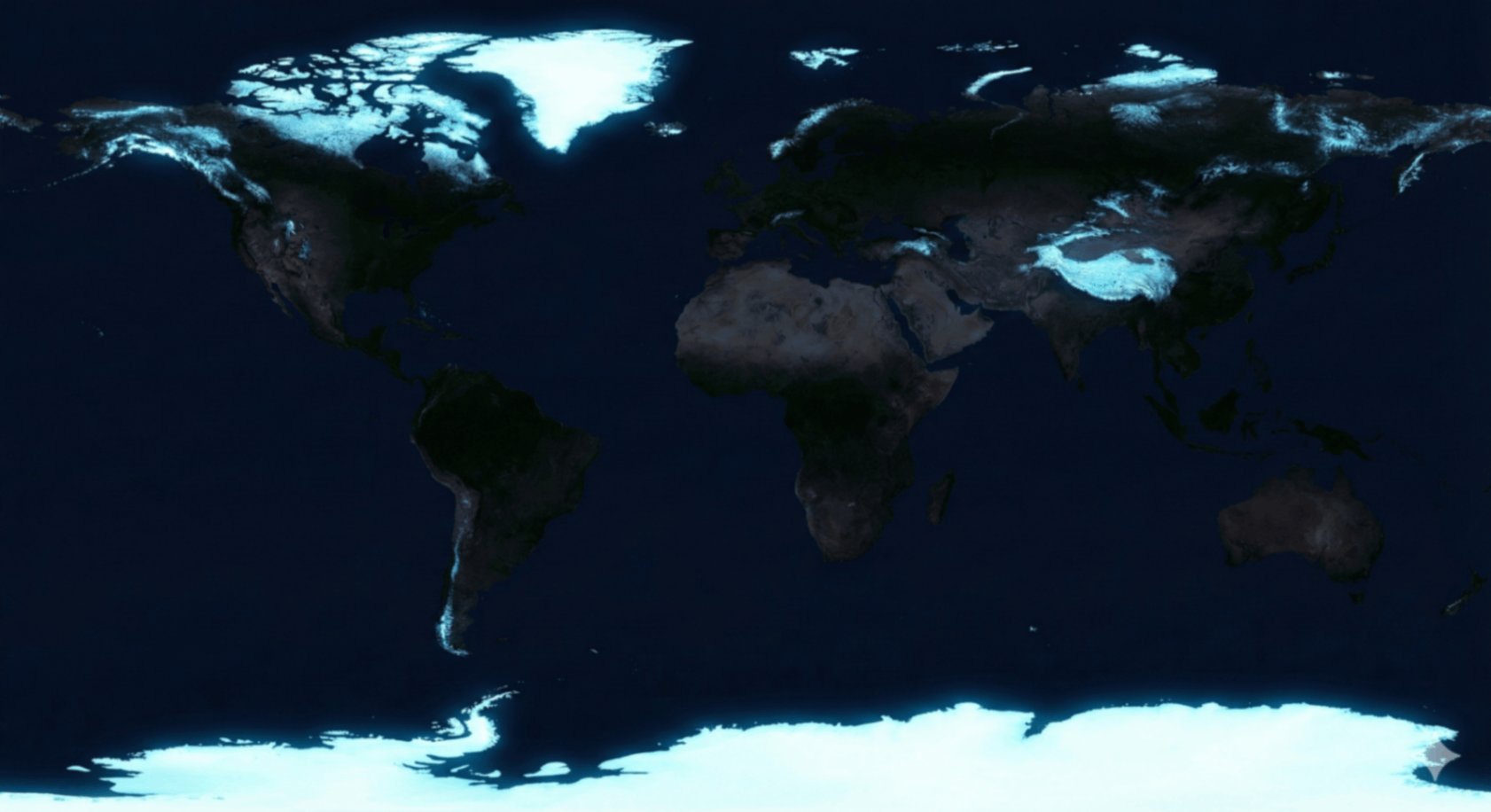
What This Glacier Map Actually Shows
This is not simply “where it’s cold.” It is the geographic fingerprint of stored water, reflected sunlight, and delayed sea level.
Comparative lens: population maps show where humans cluster, shipping maps show where goods move, and night-light maps show where electricity burns. A cryosphere map shows something more structural—where the planet keeps water locked away and where it stays bright enough to reflect solar energy.
The biggest signature is the polar dominance: Antarctica and Greenland are the heavyweights. The second signature is “thin white spines” on mountain belts: Himalayas, Andes, Alaska, Rockies, Alps. Those spines matter less for total ice volume, but disproportionately for rivers.
The World’s Freshwater Battery
Most of Earth’s water is salt. Most of Earth’s freshwater is not in rivers or lakes—it’s frozen. That makes the cryosphere the planet’s primary long-term freshwater reserve, and a key reason why “ice loss” is a water story, not only a climate story.
Ice sheets dominate long-term storage (centuries+).
Mountain glaciers affect seasonal meltwater (years–decades).
Coasts pay the price when stored land ice becomes ocean water.
Sea Level Rise: The Mechanism Most People Misunderstand
The core distinction is simple and highly searchable: land ice vs sea ice. Melting floating sea ice has little direct effect on sea level; melting land ice (Greenland, Antarctica, mountain glaciers) raises sea level because it adds new water to the ocean.
Comparative framing: losing sea ice is like removing a mirror (it accelerates warming via albedo). Losing land ice is like adding water to a bathtub (it raises the baseline that storms surge from).
Two Paths to Higher Water
- Mass addition: land ice flow + melt adds water to the ocean.
- Thermal expansion: warmer oceans take up more volume (even without extra water).
A glacier map is a delayed coastal flood map.
Tipping Points: Why “Slow Melt” Can Become “Fast Loss”
The popular mental model is an ice cube dripping. The operational model is instability: once certain geometry and ocean conditions align, ice shelves can thin, grounding lines can retreat, and flow can accelerate. That’s why analysts track specific regions as “systems,” not scenery.
Thwaites (West Antarctica)
Often described as a keystone glacier because its destabilization can accelerate broader regional ice loss. The key risk is not a single event, but a shift into persistent retreat dynamics.
Albedo Amplification
Snow and ice reflect; ocean absorbs. As reflective area shrinks, more heat is retained—raising melt rates. This loop is why polar change can outrun global averages.
Ice Cores (Climate Archive)
Layered ice traps ancient atmosphere, enabling reconstruction of long CO₂ histories. This is why cryosphere science anchors climate attribution: it provides a physical record, not an opinion.
Permafrost Thaw (Methane)
As frozen ground warms, stored organic matter decomposes and can release methane and CO₂. This does not require “new” fossil fuel use— it is a climate feedback from previously locked carbon.
Water Security: The “Third Pole” and the River Futures Problem
The Himalayas and adjacent high ranges are often called the Third Pole because they store the largest concentration of ice outside the polar regions. Their meltwater supports major river systems and seasonal flow stability. That makes mountain glaciers disproportionately important to food systems, hydropower reliability, and drought buffering.
Comparative insight: polar ice is the long game (sea level). Mountain ice is the near game (rivers, agriculture, and water stress). The same cryosphere map therefore predicts two different risk timelines depending on region.
The “Peak Water” Pattern
Many basins experience a temporary surge in meltwater as glaciers retreat—followed by decline once ice volume falls below a threshold. This is the hidden trap: short-term abundance can mask long-term scarcity.
Arctic Thaw: Shipping, Resources, and Border Math
When ice coverage changes, maps of trade change. Shorter seasonal routes can alter logistics costs, port relevance, and strategic choke points. That’s why the cryosphere layer is directly comparable to shipping routes.
New passages can reduce distance, but add uncertainty, insurance cost, and seasonal volatility.
Seabed access becomes more competitive as ice retreats, raising governance and security stakes.
Fragile systems face spills and accidents in harsh environments with limited response capacity.
The Identity Challenge (World Pulse Gameplay)
In the World Pulse Game, this dataset is commonly confused with population density and night lights when zoomed out. The winning move is comparative recognition—shape, not emotion.
How to distinguish the Cryosphere:
- Strict latitude dominance: heavy polar signatures (Antarctica/Greenland) that ignore borders.
- Mountain “spines”: thin ridgelines (Andes/Himalayas) rather than city blobs or coast glows.
- Ocean vs land texture: sea-ice outlines polar oceans; land ice caps sit on landmasses.
- Opposite of “where people live”: the brightest regions are often the least populated.
“Night lights show where we spend energy. Glacier maps show where the planet used to reflect it.”
FAQ + Glossary (Search-Friendly)
fast answers • high intentIce on land (ice sheets + glaciers). Melt raises sea level when it reaches the ocean.
Floating ice. Melt mainly affects albedo and ecosystems, not direct sea level.
Reflectivity. Less ice → more absorption → more warming → more melt.
All frozen water on Earth: glaciers, ice sheets, sea ice, and permafrost.
Is this a “climate change map”? It is a cryosphere map. Climate change is the driver; the map is the storage system responding to that driver.
Why does this matter for cities? Because sea level rise changes storm surge baselines, flood frequencies, and infrastructure planning horizons.
Why does this matter for inland regions? Because mountain glaciers stabilize river timing, supporting agriculture, hydropower, and dry-season flow.
World Pulse Track: Related Layers
The cryosphere is best understood by comparison. Use these layers to triangulate meaning: energy use, human density, and logistics.
Initiate Simulation
You’ve read the briefing. Now identify the cryosphere without labels—side by side with population, night lights, shipping, and networks.
Launch Map Test