Signal Summary
What the footprint tends to correlate withRefrigeration, warehouses, supplier QA, and predictable last-mile distribution.
Regular discretionary spending, commuter rhythms, and high-footfall corridors.
Licensing, franchising rules, import regimes, currency stability, and contract enforcement.
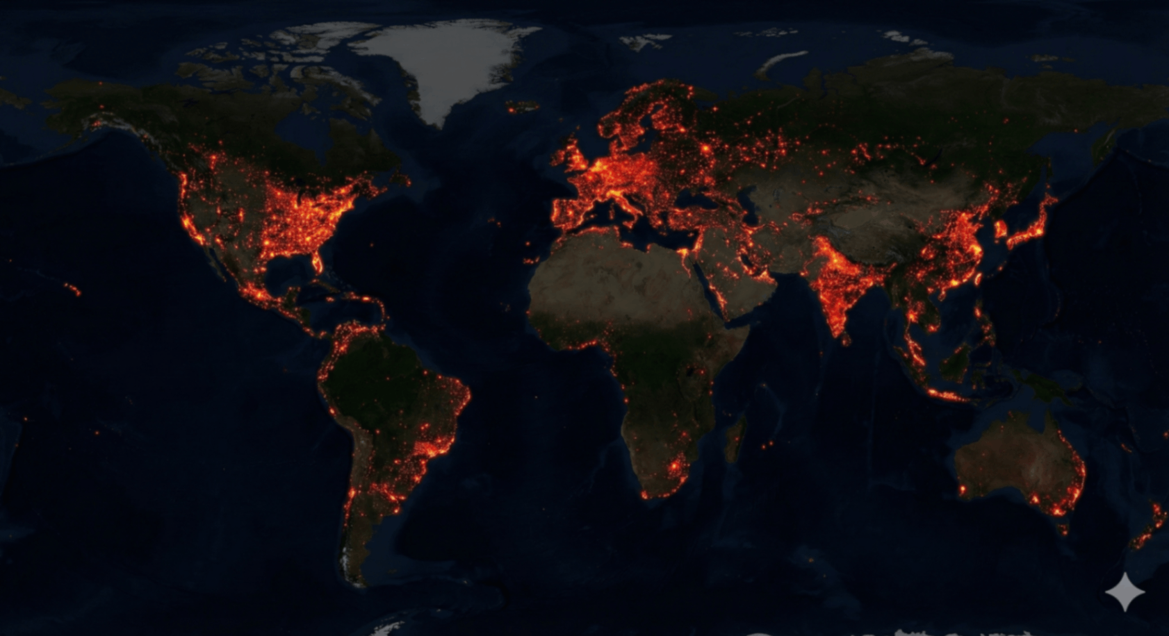
Thomas Friedman popularized a provocative idea: once two countries both host McDonald’s franchises, they are less likely to fight each other. The statement is historically contestable, but the dataset remains valuable for a different reason—because it is measurable, global, and visually distinctive.
If you treat this as a “peace map,” you will miss the real lesson. The franchise footprint is better understood as a map of operational capacity: where standardized food systems can run without interruption, where refrigerated logistics can be trusted, and where high-volume consumer routines are stable enough to repeat daily.
What a Single Dot Really Encodes
Each point on the map is an endpoint of a long industrial chain. The store itself is the easy part. The hard part is everything upstream that must function reliably for the store to serve a consistent product: power, water, refrigeration, inventory planning, supplier audits, distribution timetables, and resilient transportation routes.
- Energy continuity: freezers and cold rooms require steady electricity and predictable downtime windows.
- Transport timing: the system depends on punctual deliveries, route reliability, and logistics redundancy.
- Supplier discipline: standardized QA procedures, traceability, and scaled procurement contracts.
- Urban throughput: enough foot traffic and repeat demand to justify high-frequency supply.
- Institutional predictability: contracts, permits, and rule enforcement stable enough to price risk.
In The World Pulse, this makes the map an ideal training layer: it looks simple, but it forces you to ask what the picture represents before you guess. That is the skill the missions reward.
Briefing Index
Fast navigationWhy “frozen fries” are a geopolitical indicator.
How the footprint clusters—and where it fractures.
False assumptions, blind spots, and business constraints.
How to identify the dataset quickly under time pressure.
Search-friendly answers and terms you can reuse across missions.
Supply Chain Anatomy: The Infrastructure Behind the Meal
A high-volume franchise is an operations test disguised as lunch. The footprint often expands where the following layers are strong enough to tolerate narrow margins, strict timing, and standardized quality.
Layer 1: Cold Chain
Non-negotiableFrozen and chilled goods require temperature control end-to-end: storage, loading docks, transport, and in-store capacity. When this fails, the business fails. This is why the map can act as a proxy for refrigeration-grade infrastructure maturity.
Stable energy + service technicians + reliable replacement cycles.
Warehouse networks, professional logistics firms, tighter delivery windows.
Power volatility, border friction, or weak maintenance ecosystems dominate.
Layer 2: Standardization & Compliance
Operational disciplineFranchises scale through repeatability. That means supplier audits, consistent inputs, enforceable contracts, and predictable inspection regimes. Even with strong demand, weak compliance environments increase operational variance and reduce scalability.
Translation: the footprint often follows environments where “process” beats “improvisation” for everyday commerce.
Layer 3: Urban Throughput
Footfall economicsThe densest clusters form where cities sustain repeat customers at high frequency: commuters, students, malls, highway junctions, and predictable leisure districts. The map therefore highlights the geometry of modern routines—where time is traded for convenience.
In the game, this creates a recognizable “metro web”: points concentrate around urban belts rather than evenly across rural space.
Operator’s Insight: Why this dataset belongs in World Pulse
Many maps in The World Pulse look impressive but are conceptually narrow. The franchise footprint is different: it quietly touches energy reliability, trade friction, urban form, and institutional predictability. It is an unusually “dense” proxy— the kind that trains you to infer systems from patterns instead of memorizing trivia.
Pattern Library: How the Footprint Clusters
Your first pass should be global. Your second pass should be structural. Ignore borders and ask one question: does the distribution look like a smooth gradient, or a set of concentrated hubs connected by high-trust corridors?
Three recurring shapes
1) Saturation belts
In mature markets, density can feel almost continuous around metropolitan areas and along highway networks. This is where convenience economics dominates: standardized service, predictable pricing, and fast throughput.
Recognition cue: “too many dots” near city clusters, plus strong suburban spillover.
2) Coastal concentration
In many regions, the footprint hugs coasts and major ports, then thins inland. This is not only about population; it is about import logistics, distribution hubs, and income concentration near trade gateways.
Recognition cue: bright coastal arcs with a visibly weaker interior.
3) Island clusters
Archipelagos often show “node islands” rather than continuous networks. Geography injects friction: shipping costs, warehousing constraints, and fragmented demand distribution. You can see logistics cost in the pattern itself.
Recognition cue: separated clusters that align with major urban nodes, not continuous land coverage.
The most useful part of the map is not where it is dense. It is where it is missing. Gaps are where you learn: the negative space forces you to consider infrastructure, policy, culture, and economics at once.
Failure Modes: What This Map Does Not Prove
A sophisticated player avoids the “single-variable trap.” This dataset is powerful because it correlates with multiple systems; it is dangerous because that tempts you to overclaim. Use the footprint as evidence of capability, not destiny.
Misread #1: “It predicts peace.”
Even if integration increases the cost of conflict, politics can override economics. The footprint may indicate connectivity and commercial maturity, but it cannot guarantee stability. Treat it as a stability hint, not a stability law.
Misread #2: “It’s just population.”
Population maps are smoother; franchise maps are spikier. Presence requires density plus purchasing power plus operations. In the game, the mismatch with population is one of your best tells.
Misread #3: “No dots means no economy.”
Absence can reflect strategy, local preference, regulation, or competitor dominance. Many strong economies do not express themselves through one brand’s footprint. The map shows one supply chain, not all commerce.
Misread #4: “One dot means prosperity.”
Isolated dots can be tourism hubs, airports, or showcase locations. Think of them as “edge probes” into demand, not definitive proof of broad middle-class depth.
Professional framing
The correct mindset is comparative. Pair this layer with your other briefings: shipping lanes reveal trade movement; internet cables reveal digital infrastructure; night lights reveal electrification intensity. Together, these layers teach you how complex systems overlap.
World Pulse Decoder
Under a timer, you do not have time to “think slowly.” Use quick tells that separate franchise footprints from population density, hospitals, or random point datasets.
Fast tells (use in 3–5 seconds)
- Urban bias: dense metro clusters and highway adjacency are stronger than rural spread.
- Selective gaps: some high-population regions under-index versus a pure population map.
- Market symmetry: mature consumer corridors appear “over-saturated” with dots.
- Business logic: the pattern looks like “where standardized operations survive,” not “where humans exist.”
- Compare mentally: if it resembles population but feels too curated, suspect franchise footprints.
Skill target: identify correctly in under one second after enough reps.
This is Mission 01 in your briefing sequence. Continue with the other layers to build a complete “multi-map” intuition.
FAQ + Glossary
Skimmable answersIs the Golden Arches Theory “true”?
What’s the most “real” signal on this map?
Why does it look similar to population density?
What should I do when I see a confusing map in World Pulse?
Refrigerated logistics system that maintains temperature control from supplier to storefront.
Spatial distribution pattern of locations; used as a proxy for underlying capabilities and demand.
Unpredictability in supply, compliance, or service that makes standardization difficult.
An indirect measure that correlates with a hidden variable (e.g., logistics maturity).
Tip: FAQ sections match real search queries. Keep answers specific and consistent with what the dataset can actually support.
Continue the Briefing
Do not stop at one layer. The World Pulse training effect comes from contrast: seeing how different systems can look similar at a glance—and learning to separate them.
World Pulse: Franchise Footprint
Play the dataset under time pressure and learn the pattern by repetition.
Cognitive Suite
Train perception, speed, and decision-making across multiple logic games.
Shipping Routes
Compare franchise footprints to the physical arteries of global trade.